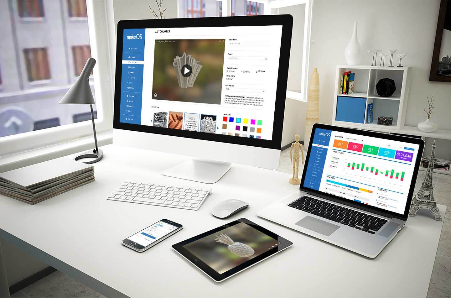
MakerOS allows professional service providers to complete projects 10X faster, save thousands on third party software, and maintain a scalable pipeline of client projects for increased revenue. The white-label platform is able to accomplish this by combining typically segmented systems such as payment processing, project management, client relationships, quoting, and inventory. The easy to use interface can be used on any device for employees and clients of the service provider to interact and complete projects together.
During public beta, more than 1,500 services from around the world signed up to use MakerOS. So what’s the problem? MakerOS was unusable because the architecture of the platform was in disarray and it did not meet the requirements of modern UI standards.
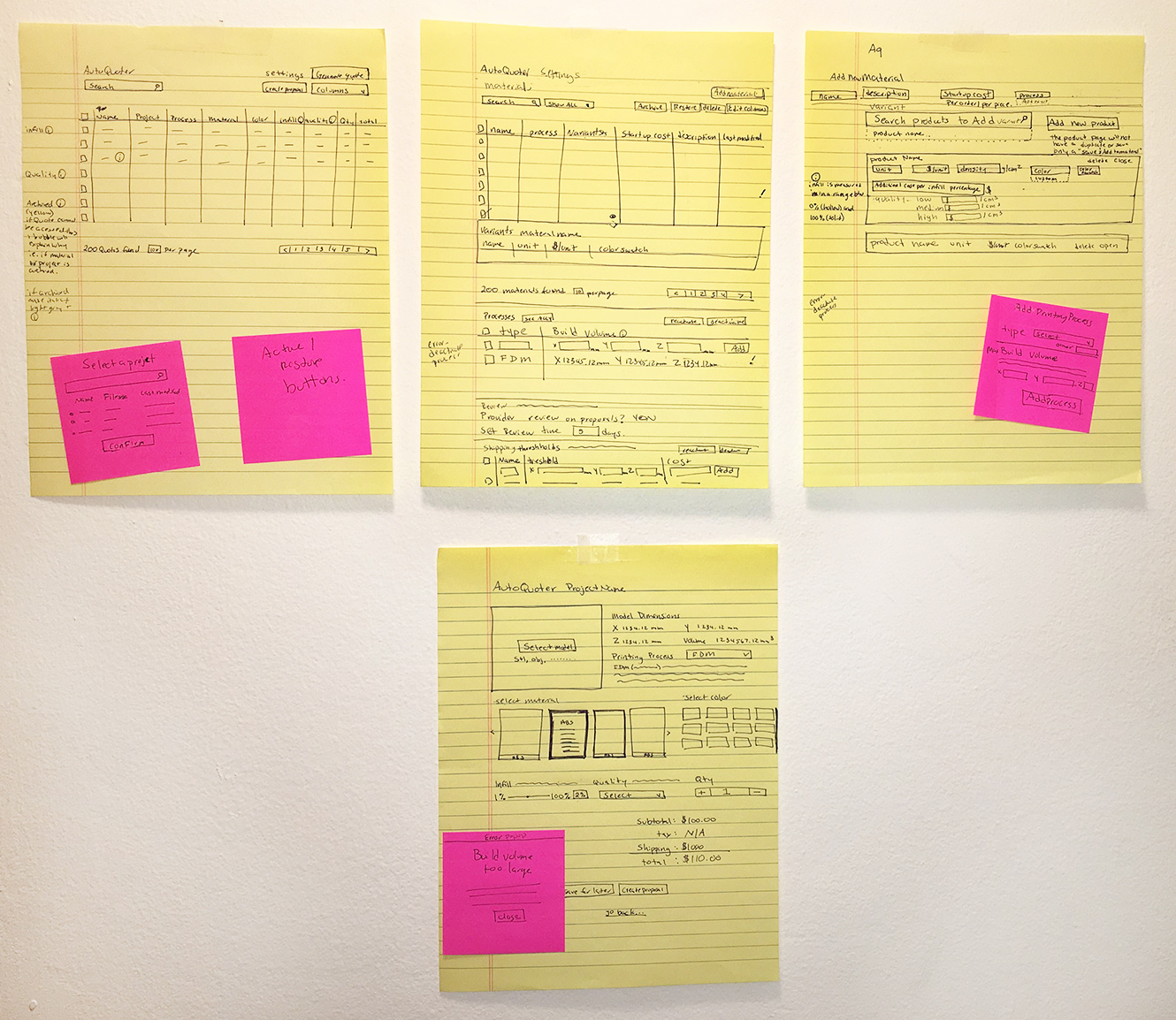
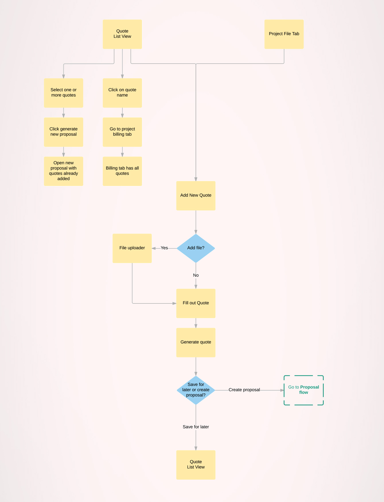
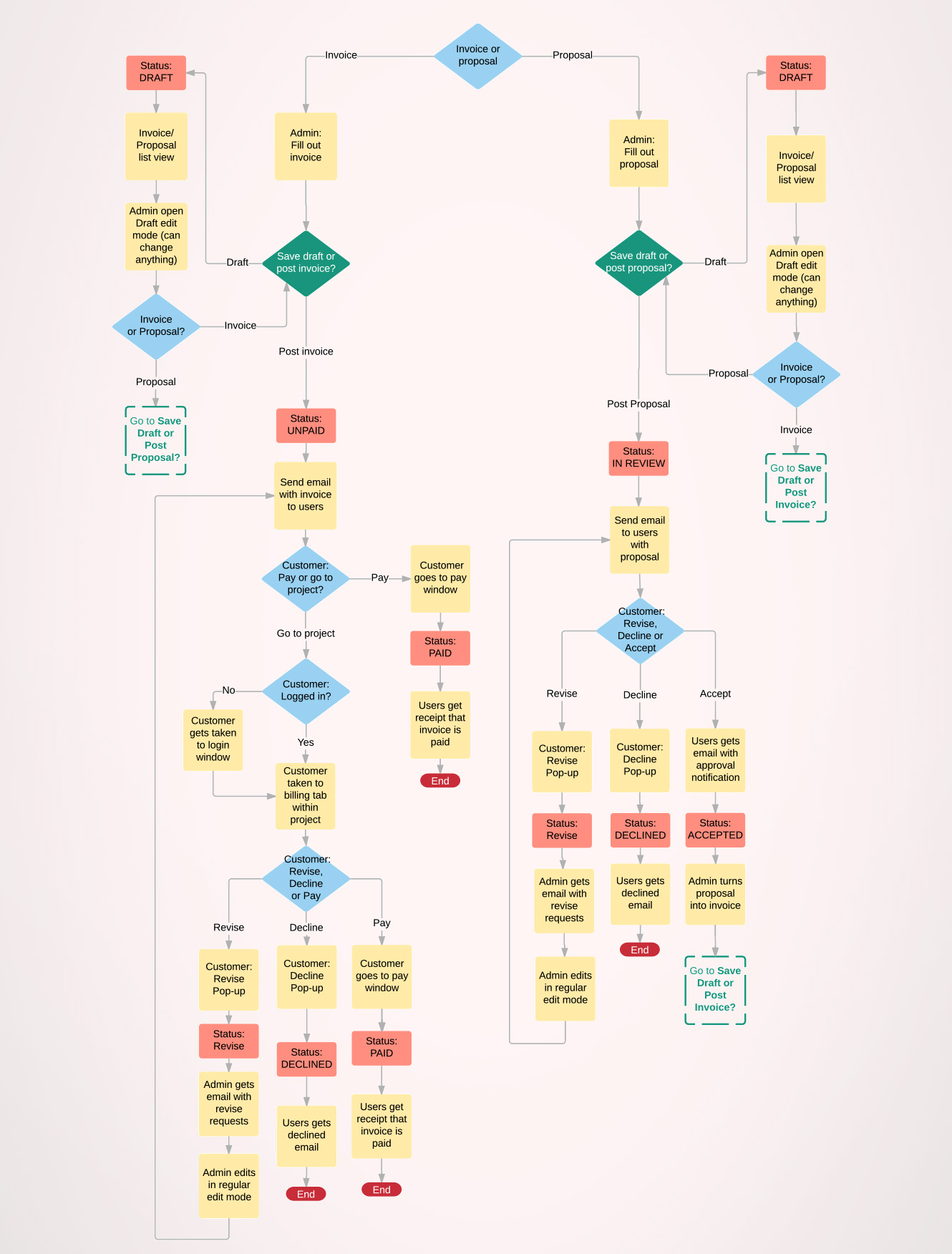
In the new interface, everything should be easily accessible, it should not take long to find the right tool. The flow between tools and the collaboration between your team and customer should be effortless. One of the first things I did was go back to the foundation and create user flows for this complex platform.
Major Product Features
PRODUCT MANAGEMENT
- Get immediate notifications for low stock and out of stock
- Set at cost and retail prices and see the markup in real-time
- Make a stock quantity unlimited to track job time or 3D files
- Measure 3D printing material for use with the AutoQuoter
BILLING MANAGER
- Create quotes and invoices from the same place
- Maintain a full history of customer transactions
- Add custom line items or import them from the Product Manager
- Use the AutoQuoter on 3D files from right within an invoice
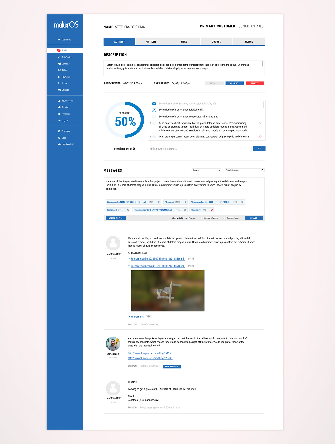
PROJECT MANAGEMENT
- Use project statuses to keep everyone in the loop
- Team and customer chat within a project
- Upload and manage any file type
- Set permissions to focus the flow of information
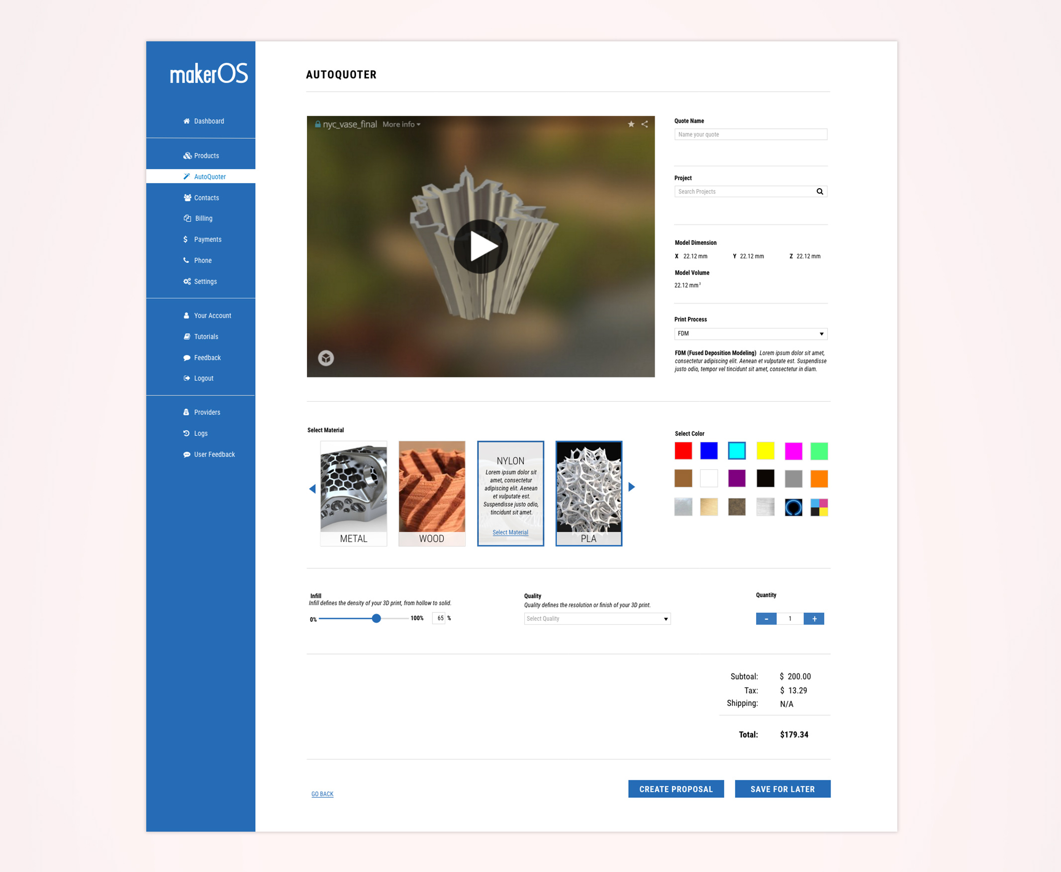
AUTOQUOTER
- Quote from a Project or from directly within an Invoice
- Links with the Product Manager to keep tabs on inventory
- Works with any STL, OBJ, 3DS, or VRML file
- Automatically fix and convert any model issues
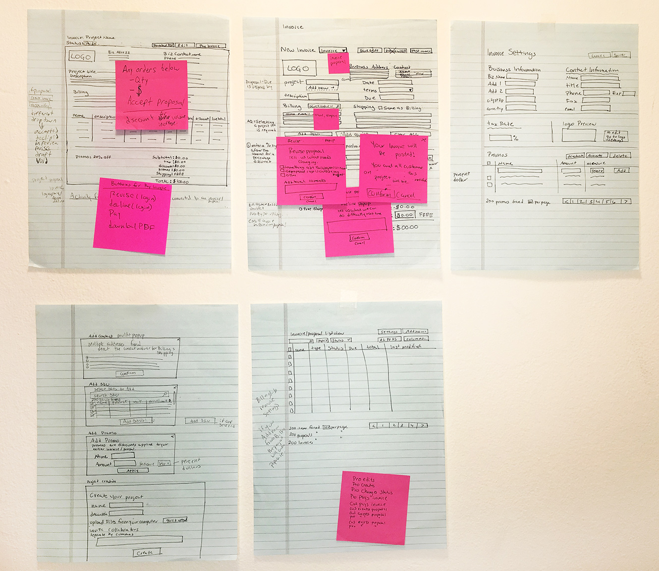
Wireframes & User Flows
User Interface Design
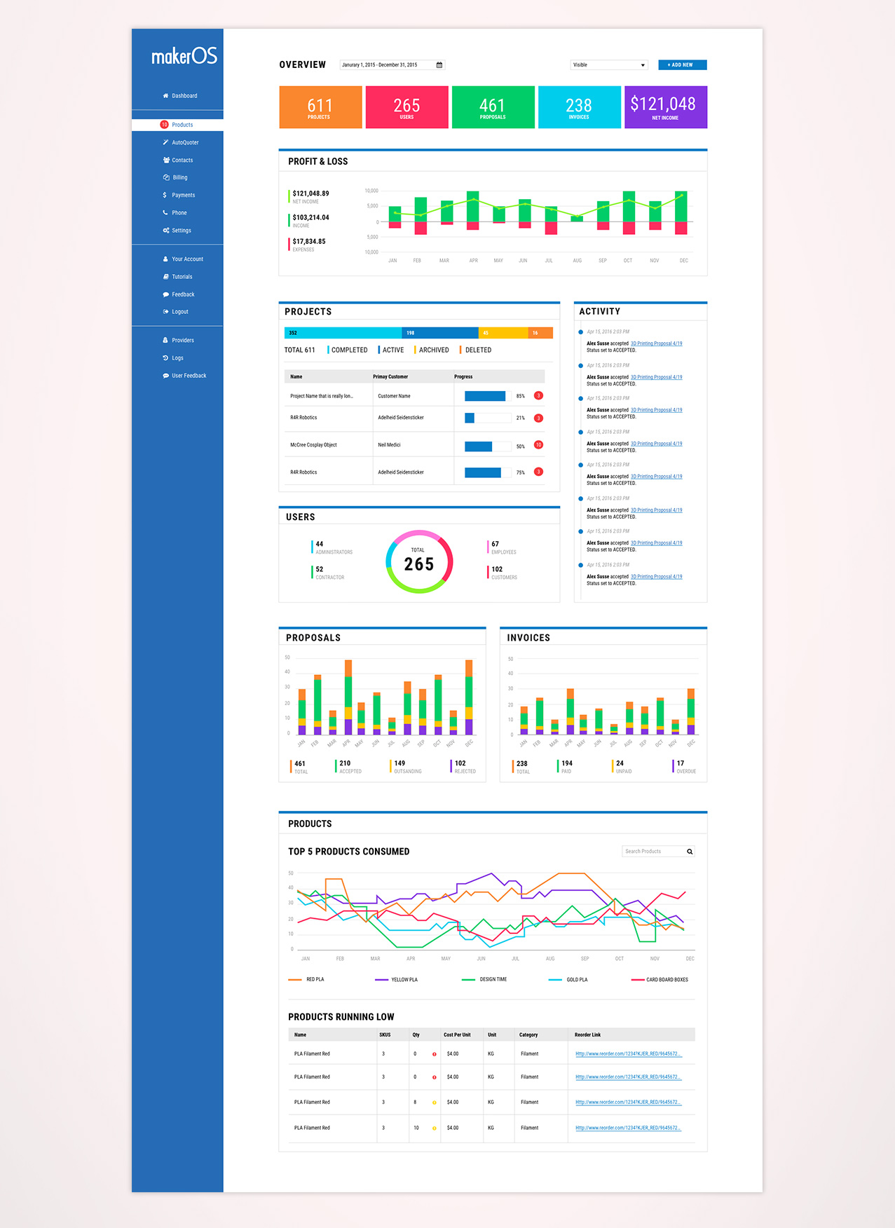
Another major goal was to provide instant access to all key metrics at a glance in your dashboard. I decided to provide the ability to create a custom dashboard so the users can decide which metrics are most important to them. I approached the design stage with a widget system because that was basically the key content of the dashboard. The widgets would intelligently scale to fit the users’ screen.
