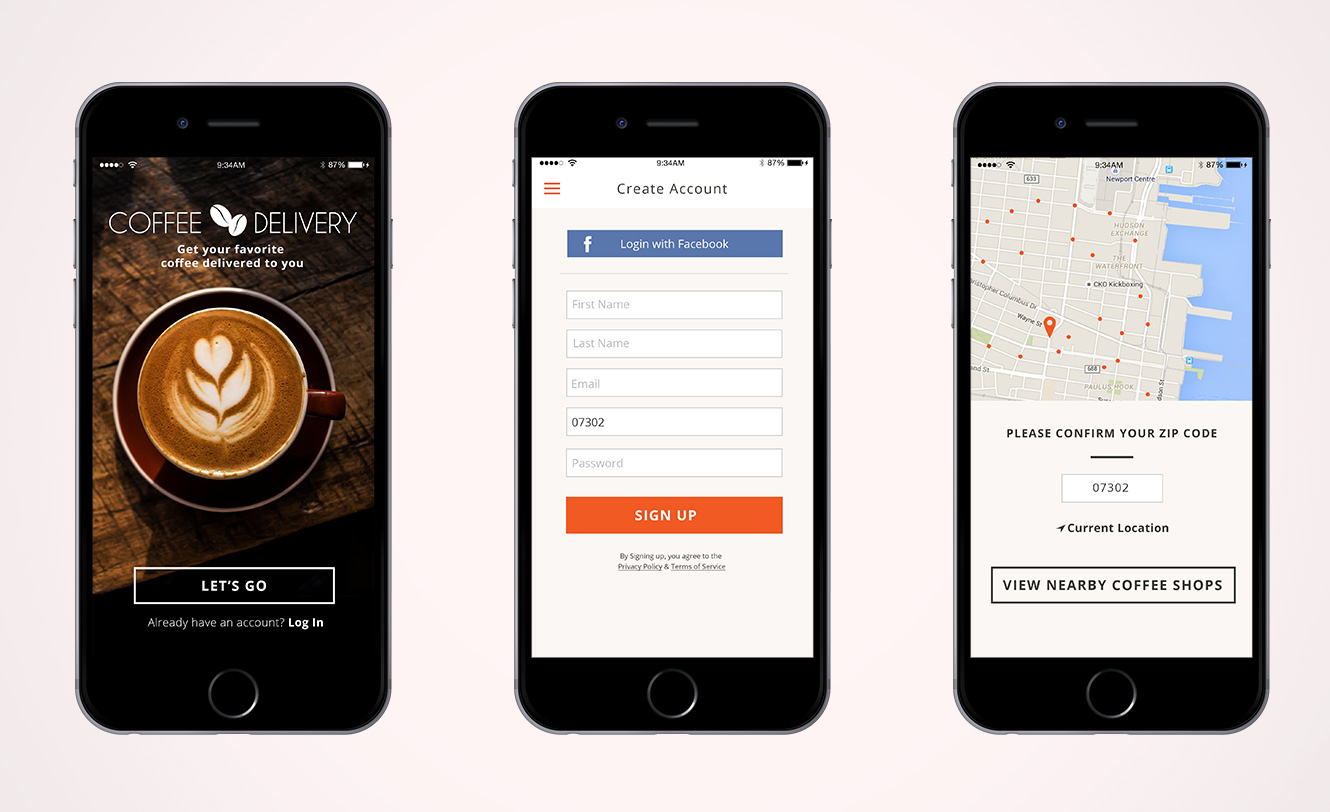
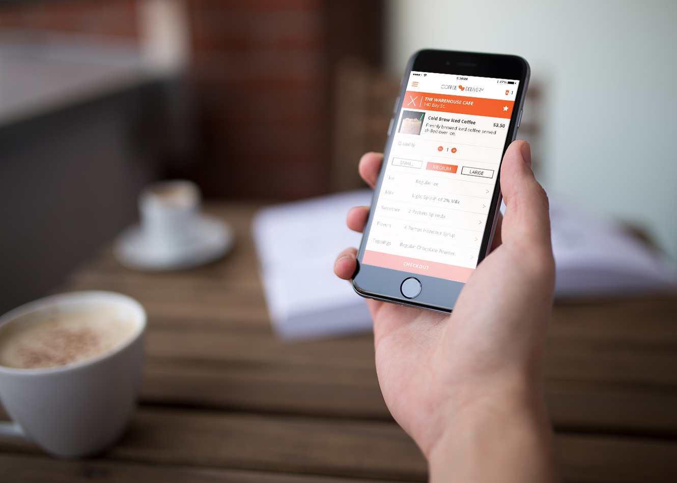
This was a concept for an iOS app that allows users to order and have coffee delivered to them. At the time, there was no way to easily order coffee and have it delivered.
The project was to design the flow for an iOS application that could make the ordering and delivery of coffee seamless. Research and competitive analysis showed that more people are interested in artisanal coffee shops over mainstream shops but that there aren’t many mobile apps that make ordering from a nearby shop easy.
The main challenge was to create a simple and effective user experience that users will want to use multiple times.

RESEARCH & FEATURES
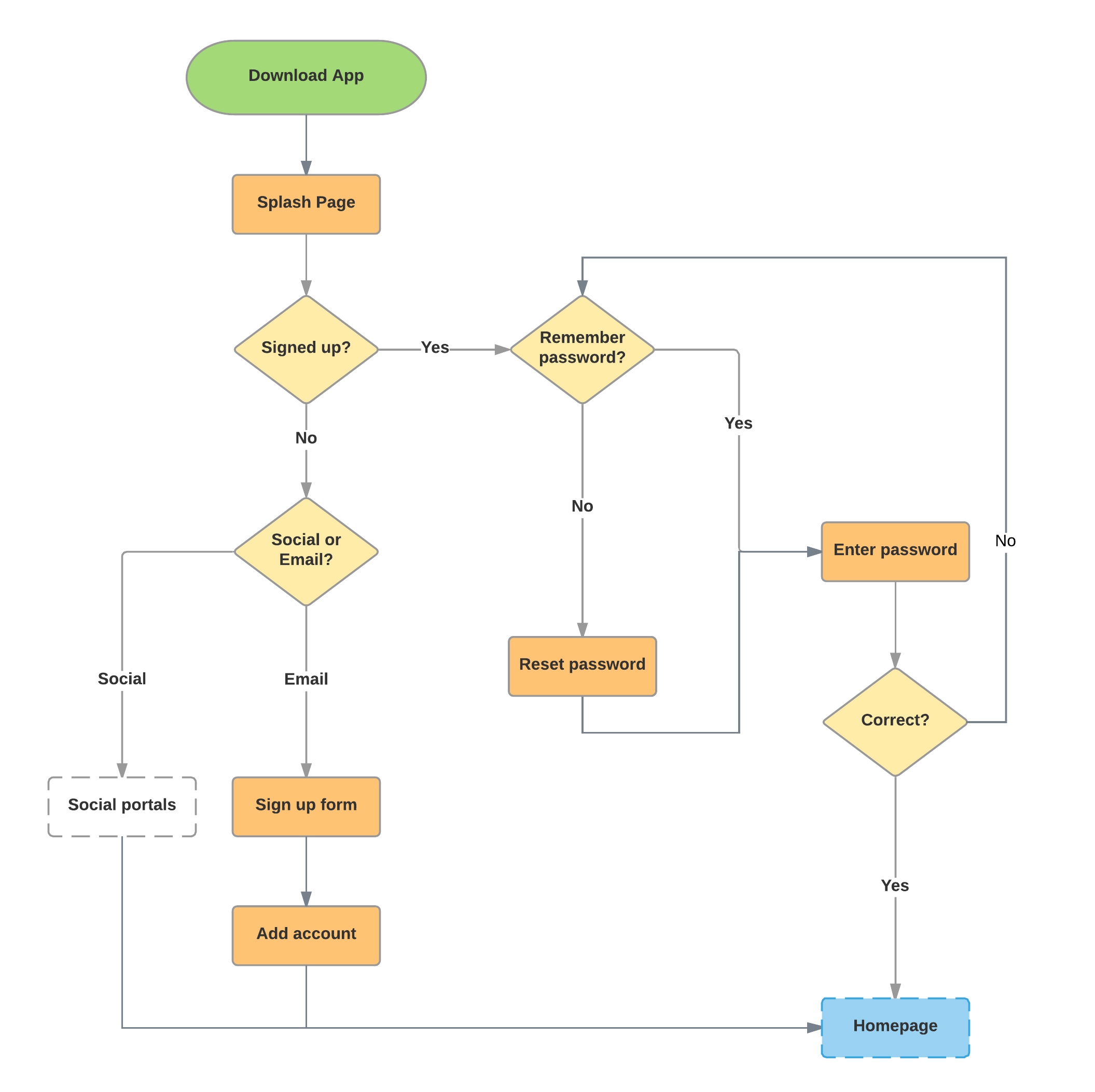
A good design starts with conversations and sketches. I started this project with interview sand brainstorming. After collecting insightful data, I sketched wireframes and flows. With the space constraint on mobile, it’s important that users do not get lost in the endless tapping. That is why I had to identify the user’s main goals using a coffee delivery app.
Must pinpoint the user's location via GPS or Zip Code entry.
Each participating merchant should have a list of available beverage and food options.
The list of participating merchants should indicate the distance and delivery time for that shop to deliver to the user.
A map to show all participating merchants.
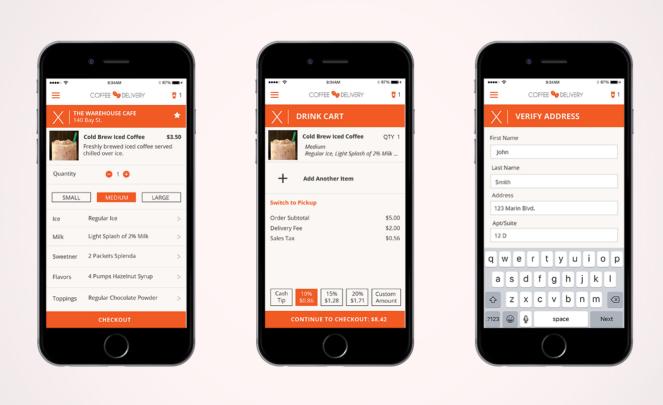
Each beverage or item must have a customization screen that includes size, options, and special requests.
Easy check out process with Paypal and credit/debit card options. Also, must have the ability to store multiple credit/debit cards.
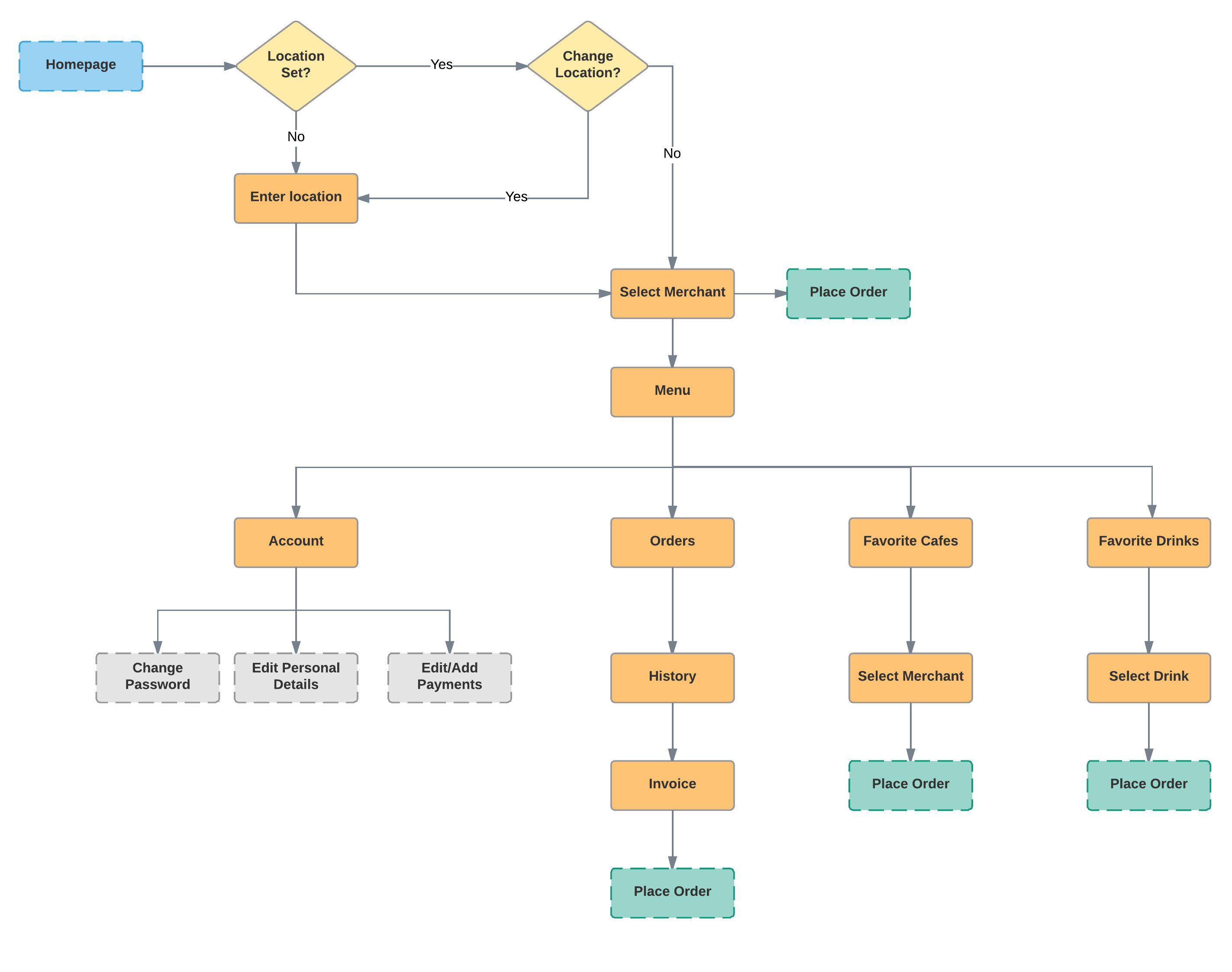
FLOWS and wireframes
The current flow allows multiple drinks to be ordered, but only in the same size and customization. If a user wants to order two of the same drink in different sizes, he/she must add the drinks to the cart separately. We made the assumption that most users would not order the exact same drinks in different sizes. However, our plan was the test this assumption once the application was built. One solution we were going to test was the ability to duplicate cart items.
User interface design
After all the flows were created, we decided to jump straight to the high-fidelity wireframes for funding purposes. I focused on designing an interface that was clean and simple.
